Thursday, October 22, 2009

Final Set up


Contextual Studio Evaluation
Jessica Kidd
05136261

Work - ‘Around the House’
(this title may yet change)

The things we take for granted. This semester I wanted to learn how to make stop motion animations, and I have achieved that in my own way. I haven’t animated models in the traditional sense but I have learnt a lot about the process of stop motion and the editing and sound process afterwards. I’m happy with my final four animations, and I think the way they are displayed works really well.
I spent a long time trying to get the shelves right so that they wouldn’t attract attention, and by painting them white, even the screws I think I have achieved this. I thought about what I was going to do with the cords for a long time, and in the end decided I like the way they look hanging down freely from the TVs, I am using technical equipment so why try to hide this by taping the cords away? I don’t even mind the cords and plugs being visible at the bottom of my wall, I just tried to make them as out of the way and tidy as possible, but again, I think they add to the whole scene.
I am going to continue to make animations, this semester has really inspired me to try even more ambitious stop motion. The concept behind this work started off as being an investigation into the way we spend our leisure time around the house, but along the way it morphed into something quite different. Now I like to think of these animations as what the objects might act like if they were like us, something people probably don’t think about very often.
I was interested to hear Sean Kerr’s (well his lamp’s) talk about animating objects with as little added as possible, while still giving them their own character, so I decided to only use eyes because I think they are our most emotive feature. I wanted to make work that was humorous, because I like to make people laugh, I don’t think art has to have a serious message to be effective, if my work can make people feel happy then that is pretty effective in its own right.
I decided to go with an uneven hanging so that when you look at them your eye travels around more fluidly. When I experimented with them how I originally planned to - in a square - I felt my eyes being drawn into the white space between the TVs too much.
I chose to use stop motion because it is an outmoded technology for animating, most things nowadays are animated using computers. So I used 4:3 ratio for my videos, not widescreen, and older TVs not flat screen to in keep with the nostalgis feeling I have towards stop motion.

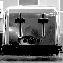
Installing the TVs


Spent all day installing my shelves today, it took a lot longer than I expected it too

The Final TV with sound added

The Final Kettle with sound added

The Final Tap with sound added

The Final Chest of Drawers with sound added

Tuesday, October 20, 2009

Friday, October 16, 2009

What Kind of shelves?

I have decided on shelves because I don't want to sit the TVs on a plinth or a table but what kind of shelves?

-Four separate shelves, one for each TV?
-One long shelf, will have less room to play around with layout than four separate shelves, plus will nned to be a lot more heavy duty to hold all four
- White shelves? To dissapear into the wall? Probably the best option, in my critique they said I was "over doing the retro aesthetic", so plain white shelves will solve this problem

Saturday, October 10, 2009

Plan for hand in

I am planning to have four TVs on one wall, or in a corner of a room, possibly facing in towrds each other so they look like they're having a conversation. I'm in the process of finishing my four final animations, and they are looking quite good. I have tried to animate them using only added eyes, so their blinks and movements are quite important. I plan to add sound to them, just the sound the actual object would make,

Kettle-Boiling noise
Tap-Turning on and off
Drawers-Opening and closing
TV-Static

I have made each animation about 1 minute long, but I am not making them all the exact same length because for the final I would like them to be turning on and off at different times, with short periods of black between each loop. Basically what I am trying to achieve with these short animations is a short snippet in the day of an inanimate objects daily routine, which in turn will prompt people to consider their own daily routines, and think for a moment about all the appliances and objects we surround ourselves with that we never really give a thought to.

Objects we take for granted

http://www.design-emotion.com/2009/07/24/sustaining-the-human-object-relationship/

There are many objects we interact with on a daily basis which help us meet our basic needs, which we take for granted. We no longer recognize or acknowledge the object for anything other than the role it plays in helping us satisfy our needs. My thesis work, Emotional Objects, explores animating products as a valid technique to engender a deeper emotional connection between objects and their users.

In his book, Emotionally Durable Design, Jonathan Chapman discusses the current state of consumer culture, and the impact this has had upon product design. Chapman believes that through our modern fixations with: technology, the surface characteristics of products, and being able to quickly generate sales; we have inadvertently designed away the more poetic and enduring characteristics of our material culture. As a result, Chapman argues that durable attachments with objects are seldom witnessed in our current consumer climate. He hypothesized that the only way for products to healthily sustain their interactions with consumers is for them to “possess a diversity and pluralism of character”. Looking at objects from this viewpoint, I find that many products within the current model of design are static and non-evolving. In sharp contrast, their users are constantly changing. It can be suggested then, that in order to form a stronger, more satisfying bond between a product and its user, designers must learn to embrace unpredictability and design objects that create situational variety.

In order to better understand human emotional attachment, I investigated the work of Harry Harlow, a prominent American psychologist in the 1950’s, who demonstrated the importance of tangible affection in social and cognitive development. Harlow studied infant rhesus monkeys to analyze the development of emotional attachment in infants. At the time, the commonly held theoretical position was that affection is an innate drive developed through the repeated association of the mother with reduction of the primary biological drives, particularly hunger and thirst. Harlow questioned this hypothesis, and focused instead upon the influence that bodily contact plays in attachment formation. Through his experiments, Harlow discovered that contact comfort was the overwhelmingly important variable in forming a bond between the infant and its mother, rather than nourishment.

Harlow’s experiments highlight the important role that our sense of touch plays in forming emotional attachments. According to Japanese designer and author of the book Haptics, Kenya Hara, “everything occurs on the skin”. By heightening the senses and blending them through design, we can begin to restore users to a more direct experience of the world, which, according to Hara, modern technology has diminished. I see the field of haptic design as a way to bridge technology and feelings, allowing us to create deeper connections and more complex sensory interactions between objects and their users.

This understanding of the relationship between emotional attachment and the senses, has led me to investigate the roles that touch plays in our everyday interactions with objects. For example, human comfort is very closely tied to temperature, with its extremes, both high and low, capable of causing discomfort and even harm through touch. We instinctively know that a metal chair should feel cooler to the touch than a wooden one. We wrap both hands around our coffee mug and hold it close to our chest to warm us on a chilly day. From these observations I developed my thesis work, Emotional Objects, in which I modified three everyday objects in order to actively call attention to their dynamic relationship with heat, and to provide the user with a deeper understanding of their interactions with these changing environmental conditions.

A teacup that shivers in response its tea going cold. A metal chair that heats up when you sit in it, revealing its aspirations to be warm and comfortable. A pan whose handle becomes impossible to grasp when it is too hot to touch with bare hands. The animate characteristics of these everyday objects allow them to facilitate meaningful interactions with their users by actively responding to their environment and evolving through their conditions of use. They inform the user about what they are, where they live, and how they should be used. By incorporating dynamic behaviors into an object’s design, I believe it is possible to create emotionally satisfying bonds between products and their users. Perhaps in this manner, we will begin to create new forms of sustainable and emotionally satisfying human-object relationships, and positively impact our current culture of consumption.

Friday, October 9, 2009


Double act put humour back into artGilbert & George's retrospective had me in stitches


Pair of jokers ... Gilbert& George at Tate Modern. Photograph: Sarah Lee

You're not meant to laugh in art galleries. Like libraries, there's an unspoken golden rule - you must observe in silent contemplation.

But when I went to see Gilbert & George's retrospective at Tate Modern the tutting was almost deafening. It was my fault. I just couldn't stop laughing. Like a mad man. Ha ha ha-ha ha! Major Exhibition has been the funniest show to hit London in years. And Gilbert & George are one of the great comedy double acts.

Others have noted the similarities between Gilbert & George and Morecambe and Wise. It's a mildly amusing conceit that doesn't go beyond one of them being taller with glasses, and the other being shorter without. Oh, and they both they live in the same house. In The Words Of Gilbert & George - an extremely funny book, by the way - George is asked about this and deadpans; "One of us is not dead."

No, Gilbert & George are more like Derek and Clive. It's life seen through the gin-soaked tears of two clowns; their respective videos Gordon's Makes Us Drunk (1971) and Derek And Clive Get The Horn (1979) are portraits of the pissed artists every bit as depressing as they are hilarious. Derek And Clive's brief burst of glory was at the arse-end of the 70s, just as Gilbert & George came to artistic fruition with The Dirty Words Pictures (1977). Both were intuitively punk. And they knew that the fastest way to an Englishman's chuckle-muscle was not just to swear loads, but to expose our total unease with our own bodies.

I actually prefer what Woody Allen might call "the early, funny ones". In keeping with G&G's manifesto, Art For All, you can see these for free. In the concourse at Tate Modern is my favourite; George The Cunt And Gilbert The Shit (1969), two portraits of the artists as young men adorned with these very legends. In the cafe, you can watch the film of them doing their sublime Bend It dance in The Singing Sculpture (1969). In bronze face-paint and dancing like robots from 1984, this anticipated Kraftwerk's camp futurism schtick by several years. Both pieces are warning signs before any idiots wander into the exhibition by mistake: "Do not take us seriously!"

Now, I know what you're thinking. "But Gilbert & George are awful! They say they love the Queen and they vote Tory!"

Oh come on now! Can't you see that's been their biggest joke of all?

Tuesday, October 6, 2009